As a rule, I am incredibly meticulous when it comes to planning. I will create a detailed checklist, which can sometimes take me a good hour, and then work my way through methodically from start to finish.
Checklist, by Terry Freedman
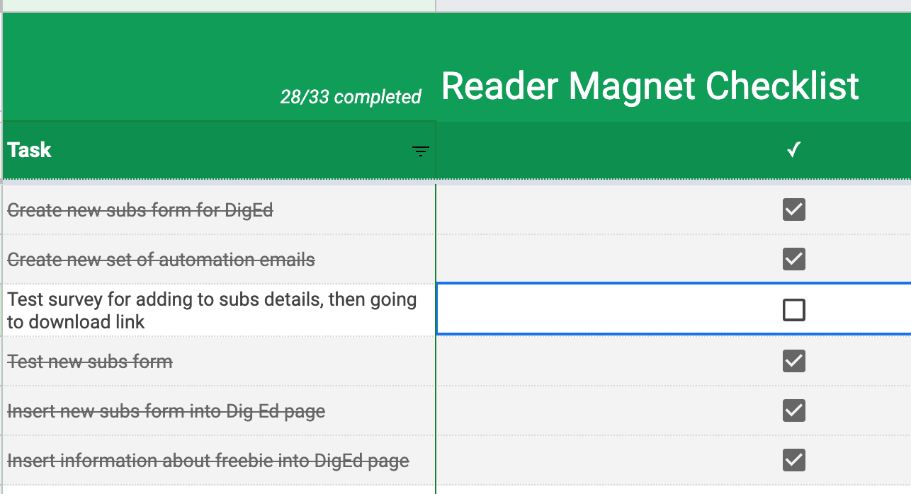
Don’t believe me? Take a look at this section form a Reader Magnet checklist I created and worked through. Marvel at the fact that I identified 33 separate tasks, and gape in wonder at the fact that I’ve completed 28 of them.
That’s the kind of thing I usually do.
When I signed up with Mailerlite to manage my newsletters a couple of years ago, I was so excited by the prospect of being able to create all different kinds of forms that I just threw caution out of the window. It didn’t really matter, because all the forms captured the same information, and had no special design attributes to speak of.
Unfortunately, that lack of planning came back to bite me. It’s the law of Karma: reap as you sow. A couple of days ago I decided to collect a bit more detail about subscribers, and offer a free ebook in return for their commitment. I also thought I’d jazz up the design of the sign-up form too.
That’s when I discovered that:
I created three different kinds of form.
They were all a bit different in appearance.
I’d embedded code for two of them in more than one place on my website — but I hadn’t made a note of which pages. I think I’ve discovered this, and corrected it now.
Therefore, regard this article as a cautionary tale. As I always say — but clearly don’t always do — it’s much better to spend lots of time planning even though it feels like you’re doing nothing.
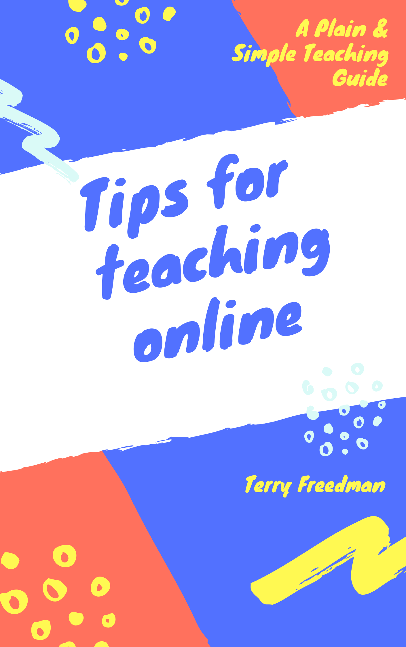
If you commiserate with me, and my having to spend hours working on this, please help me to feel that it was all worthwhile by signing up to my newsletter, Digital Education! For a limited period of time I’m offering a free ebook called Tips for Online Teaching to subscribers.
Find out more about the free ebook by clicking on this image. Doing so will take you to an article that will tell you more ab out the book, and about the Digital Education newsletter.


