Building up slowly: more changes to this website
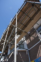
Walk past any building site, and what will you see? More than likely, people lolling around drinking tea. Yet as you walk by every day you notice something strange: slowly, inexorably, the building is taking shape. Here is some scaffolding where only yesterday was an empty space; there a wall, where only yesterday there was scaffolding.
Thus it is with this website. From your point of view, no doubt, I am lolling around drinking tea. Yet look more closely, and you will notice changes here and there. Small, incremental changes, but not insignificant ones I hope.
Last week I listened to the reminder from Doug Woods that blue/yellow was almost as bad a colour combination as red/green. So out went the yellow background and most of the blue text, apart from the hyperlinks.
As another aspect of making the site accessible to all, I've been experimenting with Talkr, which converts text to speech automatically. Unfortunately, it would seem that if you have article summaries, Talkr converts the summary and not the main article. So, out went the summaries despite the fact that I quite liked the idea of presenting several headlines and abstracts on the front page of the website: what a glorious choice the visitor had!
Sadly, ditching the summaries had the unintended consequence of making the early (summarised) articles unamenable to conversion to speech. I hope you will agree that this is a small sacrifice for the greater, and longer term, good.
Of course, this now meant that having five articles per page required, in Ray Tolley's words, "having to endlessly scroll further down the page in case there is a different topic further down." Therefore I took a leaf out of his book and reduced the number of articles to just one per page -- but still with the last six headlines just over to the left of the main area.
Like any consultant, part of the purpose of my website is to make it easy for people to find out what I do and why I'm qualified to do it, in the hope that they will offer me some gainful employment. So up went the CV (resumé) in a web-friendly form, on the page titled Assignments Undertaken.
Lastly, I added a section called 'Social Profile' which gives my addresses on Twitter, Linked-In, and elsewhere. Rather cleverly, Squarespace allowed me to make that visible only on the 'Contact Us' page. (If you're impressed enough to want to create your own Squarespace website, you might consider clicking on the 'Powered by Squarespace' icon on the right-hand side of this page. That links to an affiliate scheme which will place untold riches into my coffers. Well, a couple of quid I think, but every little helps, to coin a phrase!)
Back to the website, and I must thank everyone who has been kind enough to provide feedback on the new site. I've done so in private emails, but I think a public acknowledgement of people's kindness would not go amiss. If you have any feedback, you can get in touch with me in all sorts of ways, as shown on the Contact Us page.
Do keep visiting! It took five years to build up the wealth of content on the original website, so please be patient! I'm doing a fair amount of posting at the moment, but you know what they say: Rome wasn't built in a day. And you can always help by suggesting an article that you would like to write.
If you like the site, please do tell others about it, comment on the articles and write about them. Visitor stats are looking pretty good at the moment, but I'm a Type A person and I need results yesterday!
But for now, I think it's time I had another cup of tea....
